How I Think About Brands
In the fall of 2022, Personal Hockey Coach (PHC) and was without a formally defined brand identity or website. I was brought on to develop both properties. The following article is a look into the methodology and process I used to define the firm identity from the perspective of the client.
I believe brands are a triadic relationship between concepts, media and experience. Firms use media to convey concepts (themes) to their clients/customers. These themes condition clients, it tells them what kind of experience they can expect while using the products or services offered by the brand. The ultimate goal of 'branding' is to facilitate and maximize consumption of the firm's services. As a brand designer I have little control over the quality of the products and services, however, I can use carefully constructed media in conjunction with themes (brand) to entice potential customers into purchasing. When I refer to brand media, I am talking about more than just advertisements. Media can include the design of the website, the orientation of the show floor, even the colours of the logo. Every design choice needs to consider the main concepts important to the brand, because this is where the intent to do business with the firm begins.
To build the brand, I needed a conceptual starting-point. I began using design elements and themes generally associated with hockey development schools. These themes were familiar with clients within this industry. Ideas like 'schools', 'high-performance' and 'training' have been at the forefront for years. From this foundation I chose two major concepts (themes) that would give the brand its character, these were notions of 'expert driven services' and 'technical competence'. I chose the former because the primary services offered by this firm rely on clients valuing expert advice and opinion. A brand that reinforces these notions must use media that is somewhat sophisticated, clean-cut, and above all else: professional. As for the latter, the services in question are rendered primarily over the Internet, which is what separates the firm from its main competitors. I thought it was important to emphasize this comparative advantage within the brand, leading me to integrate notions of cutting edge technology and a streamlined UX. The media, especially the website UI and visuals, would need to fit a certain character consistent with successful, even ubiquitous tech companies.
Once I defined the themes that serve as the central conceptual pillars of the brand, I began working on a website and media that could reinforce them. I knew that the firm would require a more contemporary website that could emphasize these excellent services and online accessibility many users come to expect from digital brands. The main focus of the media would be highlighting these expert individuals, as well as the superior technical advantages of the primary services.
When it comes to conveying concepts through media, the finer details often communicate the most. The 'feel' is important in this world. The assets these designers create must be fine-tuned to this 'feel', which is in other words, to embody the concepts important to the firm. A well crafted brand concept is good because it is consistent, present throughout all media, web design, and advertising. A good example of this kind of consistency can be found in the media produced by Binance or Google. The style, colours and images are so closely related to the brand, the average user could see their media without any title and know the source. Consistency of this magnitude is difficult to execute, but it is the ideal. Brands that achieve this kind of consistency are more likely to invoke the highly advantageous quality of familiarity.
When it comes to brand consistency, colour becomes a necessary tool that must be used properly to ensure success. The firm leadership had previously chosen the colour red to represent the brand, which was later changed to a darker, online-friendly shade. Gray was chosen as the primary block colour, and secondary colour overall. When we introduced the primary conceptual pillars, these colours needed to fit nicely, or even reinforce what we had in mind. The primary brand colour is a major design decision that is the first step to consistency. We were lucky in this sense. Red fit well with the theme of experts, invoking notions of knowledge, seriousness and intelligence. As for the secondary block colour, gray was already associated with technology, standardization and autonomy. With regard to gray, the brand is walking the line between tailored, personalized services and widespread accessibility. Too much of one takes away from the other, so it is important other media on the website and in advertisements maintains this balance.
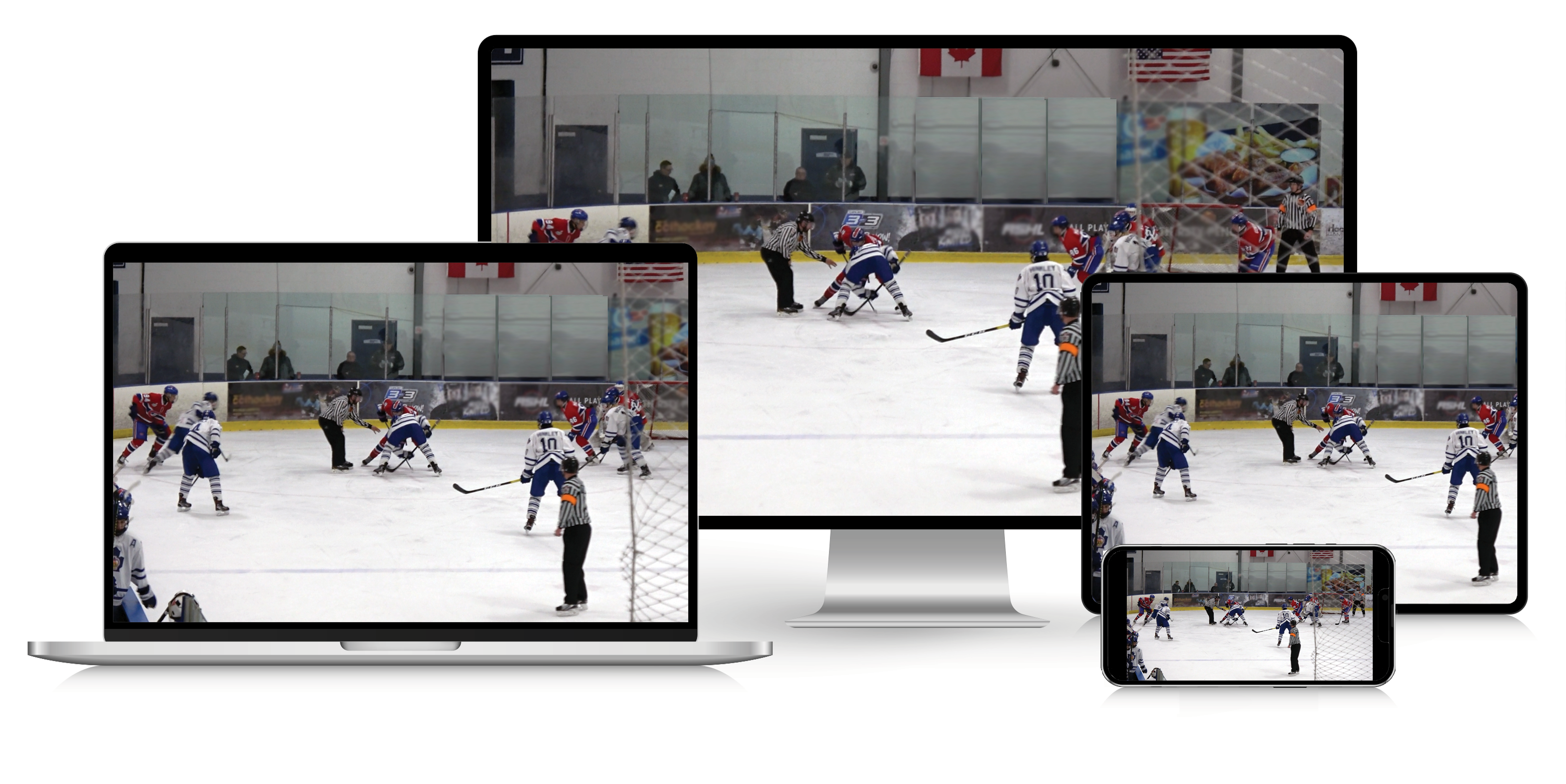
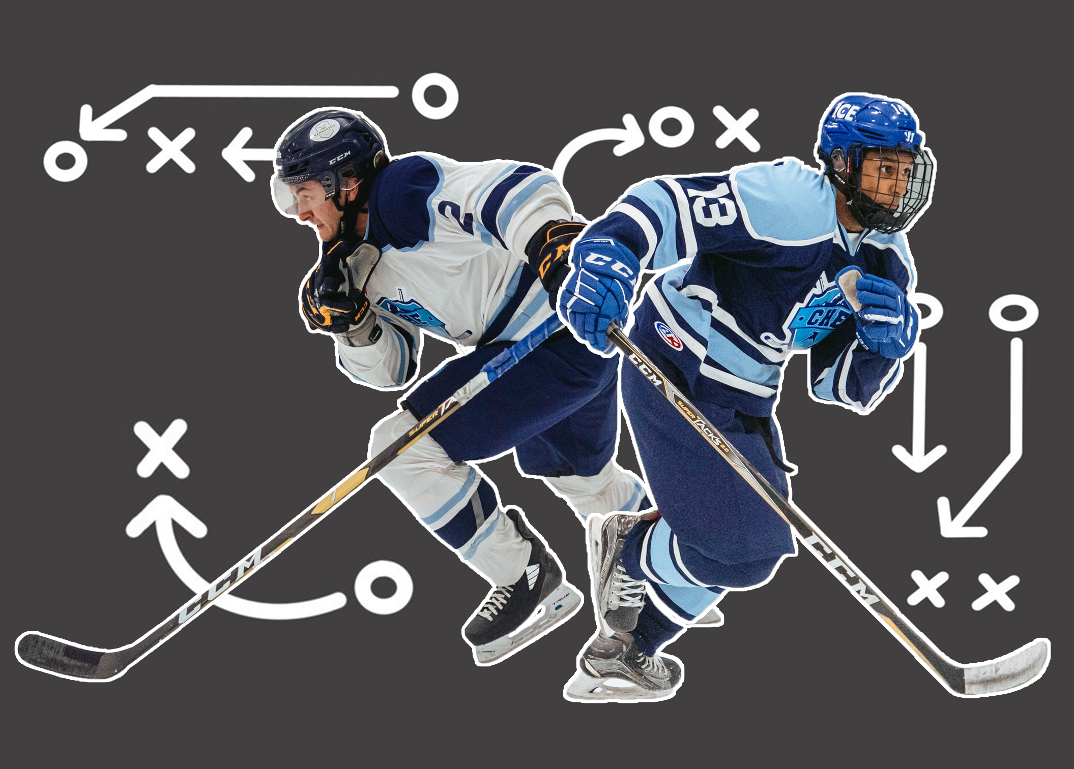
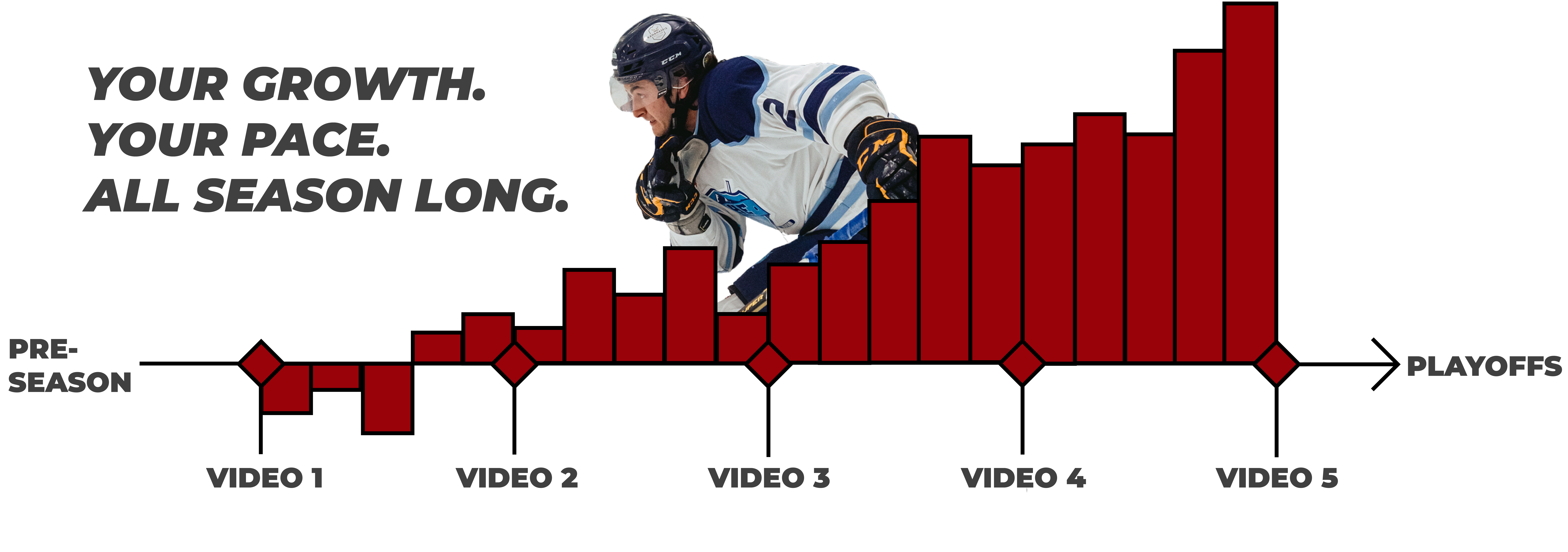
The PHC brand splash images were created using many of the available media assets from previous photoshoots. These images were retooled to emulate individual achievement with a 'blank-slate' appearance. The blank slate allows clients to imagine themselves within the training experience. These visuals were paired with 'technical elements' that highlight a variety of aspects including data driven results and online conferences. These little details push the concept of personal skill refinement with technical prowess and competency.
Apart from creating media of a certain character, we knew the website needed to be easy to navigate. This UX discussion is perhaps better suited under the category of web design, but the feel of the 'technology' behind the UX is nevertheless an important and foundational element of this brand. There needed to be consistency between the UX and media featured on the web pages. A good example of this is the graphic that showcases a step-by-step process for a service. On one hand it educates the potential client while also suggesting the services themselves are easy to use. As I mentioned earlier, emphasizing technical advantages can alienate certain clients less technologically literate, so it is important to tread carefully. The firm wants to emphasize what its technology can do, while maintaining an ease of access and use.
The first steps of this firm's brand were a success, and leadership was pleased with the strides I made in laying a foundation ready for clients. While the firm was successful without a clearly defined brand, this web identity and presence will facilitate an expansion of their services with a jump into the online ecosystem. Where phone calls and word of mouth drove the business offline, the brand, including its concepts, media and experience will retain customers online for years to come.
Disclaimer, the use of company assets and information was approved by the firm for use in this post.


