Building An Online Identity
The leadership of the Center of Hockey Excellence (CHE) was looking to redesign their website during the Covid-19 pandemic. I was hired on to lead this project. After evaluating the existing asset library, I proposed the redesign expanded to include a brand refresh and expansion of their digital footprint. The leadship team accepted my pitch, and work began on reformulating the CHE brand. The hockey training and development school was interested in presenting a more professional academic identity online. I was tasked with building a new online identity that could emulate these concepts while respecting the colours, themes and culture important to the firm.
Following approval of the project plan, the very first asset I designed was the new logo. This new design added a sleek modern flare that fit with the contemporary hockey development scene while remaining familiar to the current expectations of the firm. The starting point served as the foundation stone for a new era in the firm's history.
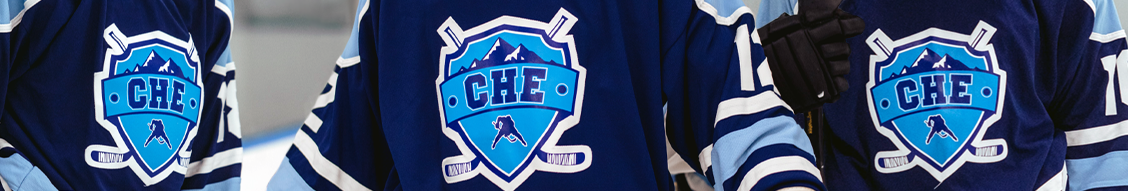

Following the logo, work was done on a new colour scheme with an approach and tone that could better reflect the brand direction. The new colour scheme made slight changes to the existing CHE_BLUE (#072847) along with adjacent colours representative of their derivative teams. CHE_BLUE (#072847) was similar to successful primary colour schemes online, additionally it was was connected to traditional hockey colours recognized throughout the GTA. White (#FFFFFF) was chosen as the prevailing background for CHE media and web pages. This decision went in line with industry standards and implicit connections to hockey and rinks.
Two photo sessions were held to provide splash imagery for the website and promotional media. The goal of these sessions was to capture stills and action shots that display speed, invoke professionalism and emulate the excellence of CHE clients. The white and blue CHE branded jerseys produced a versatile image set that could be used throughout the website. These stills also served as stencils for future graphics and additional composite media.
The important aspect of the brand refresh was making sure the end result balanced traditional expectations of hockey development schools with a contemporary digital firm that is associated with accessible products, excellent professionals and cutting edge technology. Competing brands either fail to translate their brand digitally, which inhibits the capture of new customers through digital channels or they lack any impression of quality professional leadership. The CHE Brand excels in these areas, which in turn has opened the door to new digital revenue streams and a greater online presence. Allowing the refresh to coincide with the web redesign has put the firm in a better position to benefit from an expansion in their online footprint and digital capabilities.
The hockey development industry is largely driven by word of mouth, but new technologies and digitization have led to a growing customer base online. Presenting a firm that is ready to accommodate this burgeoning group provides CHE with a cutting edge. The brand enhances both the web presence as well as complements existing ways the firm finds clients.
The launch of this brand refresh coincideded with the upgrade to production of the new CHE website. Without going into too much detail, this website used an efficient structure that allowed users to easily navigate CHE products and information comfortably on web and mobile. The overall style of this website reinforced the new brand, and vice versa. The new look and extended capabilities of the website and its products enabled the firm to grow rapidly in the two years following the launch.